

In recent weeks, I've been asked on a couple occasions what software I use for making the maps that I post here on the blog and elsewhere. In response to those inquiries, the answer is GIMP: the GNU Image Manipulation Program! I've seen a few very crisp maps pop up in my social media outlets recently, too - so hopefully its catching on!
Whenever you guide someone to GIMP, though, it tends to happen with the caveat that there is a significant learning curve - something that is true, in most cases, but not necessarily the case when you're trying to do simple images, simple maps in the style of old TSR publications. So, in addition to providing guidance to the free, open-source program, I wanted to provide a basic guide - tips and tricks I've learned, assuming you have a basic knowledge of GIMP or you have the basic capability to Google stuff (e.g. "how to draw a straight line in GIMP") - so as to empower people to produce new, crisp content with all the nostalgic goodness of old-school products. Googling around, speaking of having decent Google-Fu, I was able to find a handful of different guides on old-school mapping - a new one every few years on a prominent forum or blog that illustrated the product at the time and gave some basic guidance - but none of the ones I saw offered exactly what I wanted. Those guides are good, as resources or to read, taken in tandem with what I have here.
So - knowing the context, knowing the environment, and knowing the objective: cheers!
Cheers, and happy mapping!
Color Codes
Original products produced in the Gygaxian epoch at TSR leveraged what is known as "No Photo Blue" to protect sales volume. Since the late '80s, however, photocopiers have been able to pick up and replicate the color more readily - and ... since the first no-copy printing, people have just been tracing the lines with a black marker before making a copy - so now, the blue and white has become a hallmark of nostalgia: to borrow a phrase from an anonymous commentator - it's a unique quirk of the OSR movement akin to if, 30 years from now, video-gamers looked back fondly on publishers' DRM schemes.But enough with the banter - when making a nostalgia map, I use the following simple color codes:
| Dark Blue: #0066FF | Light Blue: #A4DDED |
Darker blue for walls and grids, lighter blue for backdrops - and then, reducing opacity, I will re-use the same darker blue for highlights and solid objects and lighter blue for water features, hanging objects, or even area-of-interest boundaries.
Initial Layers
When creating a new file, ensure the image size is evenly divisible by 100 pixels on both axes. This makes life easier in ways that will become apparent further along in the article.
This will create a new file with one layer - a white Background. Using the paint bucket tool, paint the background light blue and then create three more layers:

- Grid
- Level 0 - Map
- Level 0 - Labels
1. Grid (s)
Selecting the Grid layer and setting your active color to dark blue, use Filters -> Render -> Pattern -> Grid to create your visible grid.
Set the Width and Height to 100 - this will mean your divisible-by-100-pixel image will be evenly divided into squares. I like to set the Line Width and Line Height to 2 and set the Grid layer to 50% opacity, as well: this will mean the grid is still visible and tangible to the viewer, but walls that you draw will pop out more, making them more easy to visually distinguish.

Under the Image menu, you'll want to configure your grid. By default, in the version of GIMP I use at least, the Horizontal and Vertical spacing is 10 pixels. I recommend changing this to 25 - or 50, if you aren't going to need a lot of precision.
Although this grid is internally unrelated to the Grid layer, if you want to draw elements that do not conform to the barriers of the 100 pixel grid, it's much easier to draw straight lines with snap-to-grid and 25 or 50 pixels is plenty granular for this kind of map.
2. Level 0 - Map
There are two techniques I use to make map levels: first, the Paint Bucket Patchwork, or second, Draw and Fill.Paint Bucket PatchworkUsing Render -> Pattern -> Grid, apply a grid of the same dimensions (same 100 pixel spread, same Line Height / Width, etc.) as your master grid to your Level - X layer. I recommend using an off-white color - maybe #FFFFEE - for this grid: that way, if you decide later you don't want that whole cell to be filled, you can use the magic wand tool to select just that one cell: whereas if you use pure white (#FFFFFF), it will select all of the contiguous filled-in areas.Why not just use dark blue? You can. You can clone your Grid layer and merge it down, if you want - and it'll do the same thing with the same visualization. I don't because I find it's easier for me when exporting to .PNG to leave the Grid layer on top: it's fewer clicks for me and it allows me to turn the grid off - or change its opacity - easily. Set your active color to white (#FFFFFF) and, using the Bucket Fill tool, fill in the areas you want active square by square. Any areas you want to fill that aren't divisible by 10 feet, switch over to the Pencil tool and - using shift-clicks - trace out the area you do want filled: then fill it in with the Bucket Fill. Optionally, once the map looks like you want it, using the Pencil tool again, switch to dark blue in your active color and shift-click a trace of the walls, as you want them to run. For this, I set the pixel size of the brush to 4: this makes it stand out better from the grid. | Draw and FillSet your active color to dark blue and the pixel width of the pencil to 4. Then, having selected the map layer you're working on - Layer 0 - Map, for the purposes of the article - draw out your walls: outlining corridors, rooms, etc - making sure to complete the circle. Snap-to-grid should make this fairly easy: whichever point you started on, snap to that point at least once such that the area is contained.From there, set your active color to white and, using the Bucket Fill tool, fill in the areas internal to the drawn borders.  For internal spaces - such as columns or pillars taking up a significant space - you can either use the pencil tool to draw the borders to those internal inaccessible spaces, use the Magic Wand to select the white interior, and then cut it out or you can use Selection -> Border tool to create one. Using a border set to 2 pixels tends to produce a line of approximately the same size as if you had drawn it freehand - but this might be biased depending on how you configure the dialog. |
I tend to use the Paint Bucket Patchwork for larger maps or maze-style maps with lots of corridors - as it allows me to fill as I go, preventing me from losing context and having to re-orient. I tend to use the Draw and Fill for smaller maps, or maps with larger or irregular spaces: as it's quicker to fill once rather than once per 10 foot square (plus more for the partial squares occupied if drawing irregular walls in a cave!).
3. Level 0 - Labels
Labels are pretty self-explanatory: using the Text tool, click to place a new Text layer on the map and type whatever label you need. I tend to roughly place all of my labels - A through Z; 1 through 26; I through XXVI: whatever you fancy - and then switch over to the Move tool to fine-tune where the label letters sit relative to the room or object they are labeling before selecting them as a group and merging them down to the Labels layer.
For font size, I use 30.
For font color, I use the same dark blue.
For font style, I use the default Sans Serif.
Can you have separate layers for individual labels? Or groups of labels? Yes - you can: but I tend to have one-to-one for map levels to labels layer. It makes it simpler when exporting to verify that only the layer you want to be visible is visible when you export.
Why not an original TSR font; or a tribute font? Mostly, I just haven't invested the effort in it. If you want to use a TSR font - go for it! A catalog of fonts used in varied D&D editions is available here.
Wash, Rinse, Repeat
Repeat steps 2 and 3 for each level of the dungeon you want to include, ensuring that Background is on the bottom and Grid is on the top, in terms of the layer stack. That way, when you export individual levels of your map - you can turn on/off the map and label layer accordingly, leave Background and Grid as they are, and each level will have the same tone to it while maintaining click-economy.Tools and Tricks
Having gone through the basics and setup for a new map, below I want to provide a list of tricks, techniques, and tools that I have found helpful to expedite map drawing and keep maps crisp. I will try to keep this updated - as I learn more, as I realize I have omitted something, or as requested to the best of my ability.Caves, Curves, and Uneven Walls
To draw a cave or an otherwise uneven surface - like tree roots, a meandering creek, etc. - simply turn off Snap To Grid. Any shape you make - unless you are much more talented at the trackpad than I am - will naturally take on a more naturalistic, uneven feel.
To draw a curved surface, utilize the Paths tool. There are better tutorials on how to use Paths on YouTube than I would be able to provide guidance for here, but in short, draw two points, apply a curve, and then maneuver the little poinkers that protrude from the ends (officially called "handles" to the corresponding direction lines in the GIMP documentation) until the curve matches what you want the wall to look like. Snap-To-Grid helps when creating symmetric curves, as it will make it easier to put the poink-handlers into points mirrored along the curve axis by pixel coordinates.
 |
 |
You can use the Ellipse Selection tool and then Select -> Border, but the border there created won't be the same pixel count as the rest of your walls.
Doors
Drawing doors makes me a liar about 25 pixel grid being good enough. When drawing a standard door on a ten foot section:- Using Image -> Configure Grid, set your grid to 5 pixels.
- Set your active color to white and, using the Pencil (4 pixel brush size), draw a line from 10 pixels in to 50 pixels in: effectively erasing that section of wall.
 |
 |
 |
- Set your active color to dark blue and, still using the same Pencil, box off the door: starting at one of the ends (the 5 or 50 pixel mark) and protruding 5 pixels out from the wall.
 |
 |
Optionally, using the Rectangle Select tool, select the door, itself and copy / paste it into a layer.

This will allow you to then use the Duplicate Layer function (accessible right-clicking the layer, itself) to create more doors more quickly from this layer - your door template - positioning them where you want them to be using the Move tool before merging them down to the map layer.
| Why not just draw them over and over? You can. From my experience, though, it's faster to duplicate, position, and merge a new door layer than it is to execute the draw process over and over. Plus, if you are putting a door onto a wall that isn't oriented in a cardinal direction - e.g. the door is facing south-west rather than simply south or west - it's easier to use the Rotate tool to rotate a door 45 degrees or whatever, depending on the orientation of the wall, than to draw it with the Pencil while still retaining consistent dimensions. Your map, your rules! |
Why not create a "doors" layer and draw it there instead of drawing it on the map and then copying it? Again, you can. From my experience, though, when duplicating layers: if you create a layer from a selection, when you duplicate that layer, transformations made to the duplicate are applied to the content area only - whereas when applying transformations to a layer not created from a selection, they are applied to the content and the blank space around it. So when you apply a transform, say - to rotate 90 degrees, the door will be now rotated, but you have to zoom out, find it, and reposition it again as its relative position on the image will have shifted with the layer. |
Are there ways around those observations? Probably. I'm not a GIMP expert - but I can share the mistakes I've made with it so that you can potentially avoid them.
Double Doors
For a double door, clone your door layer, shift it down (or over) until it matches, and merge down. Or, if not doing the layer approach, use the door-drawing procedure a second time.Swing Indicator
I don't typically indicate on the map which way a door swings, as it is either implicit (a door with a lock will typically open inwards, as otherwise someone can just pop the hinges) or I can indicate in the key how the door opens (this door slides up like a portcullis; this door rotates; this door pushes in and stops after five feet; etc.) - but if you want to do it, here's a quick way:- Duplicate your door template layer (or draw a door, select the door, copy, paste to new layer, and reflect on how I told you this would be easier with a separate door template layer earlier) and place it where you want it.
- Duplicate your new door layer and use the Rotate tool to pivot the secondary door. I use 90 degrees, as it's sufficient to indicate direction and can be effected quickly by selecting the layer and using Layer -> Transform -> Rotate 90 Degrees.
- Position the now rotated door such that the base aligns with the hinge on which the door opens.
- Using the Paths tool, draw a path between the open ends of the door. Apply a curve on the path and adjust the little endpoints such that the curve looks good - about 20 pixels in, following the grid axis line.
- Ensure your open door layer - the open door indicator - is selected and then, in the Paths box, right click the path and select Stroke Path. I tend to prefer line style "dense dots."

 |
 |
 |
- Optionally, set the opacity of the duplicate door layer to 75%.
- Ensuring that your open door layer is under the standard door, merge the two together.
 |
 |
Stairwells
Stairwells being the classic method of getting down into a dungeon, a stairs-indicator is fairly easy to draw with Snap To Grid enabled with a 5 pixel grid size, same as you would use when drawing a door. Using the Pencil tool - dark blue, 4 pixel Brush width - draw three lines parallel to the wall from which the stairs begin. The position of these lines should be at the 25, 50, and 75 pixel marks and should constrict their length by 5 to 10 pixels on either side, depending on how rapidly you want the stairs to descend. |
 |
Full Stairs

Whether or not to give your stairs body is up to you. I tend not to do it - not because of the somewhat infinitesimal amount of extra work you have to do, but because I'm happy with the minimalist look above.
Spiral Stairs
- Designate a square for the spiral staircase to be and create a new layer for the spiral stair.
- From the center of the square, draw lines out to each edge in the cardinal directions.
- Designate an entry spot on the four new sub-squares. Proceeding in a circle, draw a line from the center point to the edge of the space, evenly bifurcating the first sub-square into slices; trifurcating the second sub-square into three slices; and quartering the third sub-square into four slices.
 |
 |
- Using the Ellipse Select tool, select the entire space - this should produce a circle shaped selection, assuming a square space to house the staircase.
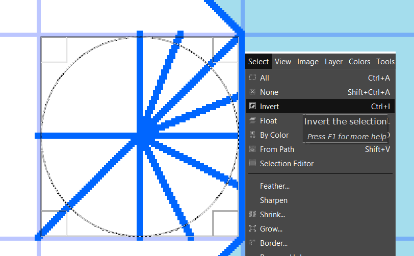
- Invert the selection (Select -> Invert) and then cut (Control + X).
 |
 |
- Optionally, to add a "bannister," use the Paths tool to draw three paths: forming a diamond around the center of the spiral stair. Then, apply curves to each and set the handlers of your curve's direction lines half-way to the corners - for a 10 foot, 100 pixel space, this will be 25 pixels - to produce a symmetrical curve along the edge.
 |
 |
 |
- Note, the "halfway" guidance is not perfect: for larger spaces, you'll need to tweak it to get the curve to conform to the true shape - but in any case, once you're satisfied with how the Path lines up, Stroke it with a 4 pixel solid line.

Alternatively, for banisters, invert your selection again, getting the initial circle back, then use Select -> Border, 2 pixels, and then color-in a ring around the stairwell. I'm not particular partial to this method because the 2 pixel Border won't match up tot the 4 pixel lines contained by it, but it is a little faster.
If you know how to make the Select -> Border tool behave a bit better, hit me up - I'm keen to learn!
Curving Stairwells
Stairwells curving along circular surfaces - such as the inner walls of towers - are fairly straightforward:
- Similar to the spiral staircase, start off by designating a square, or squares, for the stairwell to occupy. Identify, also, a radial point to serve as your vanishing point
- Create a new layer for your curving staircase and set your grid (Image -> Configure Grid) to 10 pixels. You can go larger or smaller, depending on how granular you want the stairs or how wide the radius is.
- From your vanishing point, mentally divide the arc into three.

For the first third of the stairs, draw a line from the vanishing point out to the far edge of the space in which the curve sits every 10 pixels.
For the second third of the stairs, draw it every 25 pixels.
For the final third of the stairs, draw it every 50 pixels, running down the opposing axis (the Y axis if the stairs climb the X; or the X axis if the stairs climb the Y) to where the stairs end. - Select the circle of the room such that the selection is flush with the stairs, invert, and cut.
- Then, select an inner circle of the room the perimeter of which is smaller than the surface against which the stairs are sitting by the width of the stairwell. Then, again, cut.

 |
 |
 |
- Optionally, add a banister with a Path and Stroke or with an Ellipse Select and Select -> Border, as described previously.
 |
 |
Stairwells curving along non-circular surfaces - oblong ovals, irregularly curved spaces - are more tricky. I have not done a lot of these, but I have two methods to follow to accomplish it - first, using a multi-point perspective "vanishing point;" and second, using Paths exclusively.
To use the multi-point perspective, follow the same steps as though you were using a circular stair above - except that, instead of drawing each line in step 3 from the center point, instead designate a "vanishing line" - a span between to points to represent the "center" - and then draw each line proportionally along this line: so, the first third containing 5 lines to delineate 6 steps, the 5 lines should have endpoints taking up about 1/3 of the "vanishing line."
 | |
 |  |
The resulting stairwell has the same feel as the circular space: though you have to free-hand a bit in order to get it to look like you want.
To use Paths instead:
- Create a layer (as always) for your stairs and draw on that layer a series of bars across the lateral space you want the stairs to occupy.
- Using Paths, frame the stairs as you want to see them - that is, the "downstairs" side of the path box should be thinner than the "upstairs" side.
 |
 |
- From the Paths tab, right click and select Path to Selection.
- On the stairs layer, invert your selection, and cut. This will leave just your curvy stairwell.
- Optionally, stroke your path to add banisters before merging down.
 |
 |
 |
The Paths method can be back-ported to work with standard stairwells, as well; but if your stairwell is straight, it's fewer clicks to just use the pencil. Likewise, the Paths method can be used to have multiple curves, but consider while doing it exactly how stylized you want to be before your map may risk losing the OSR vibe.
Paths (and Stroking Them)
On several of the specific guides above - I've advised using the Paths tool. The official documentation is here, and I can't give you a detailed guide on everything that is possible with paths, but I want to bring them up as something you want to experiment with: they provide virtually endless possibilities. I tend to use them to identify various elements of a room I intend to describe in the key:
|
|
|
|||||||
|
|
|


Hot tip to remember - if you only want to stroke, fill, or otherwise manipulate a subsection of a path, if you use the Select tool - any shape - the action you specify will exclusively be applied to the selected area. Thus, from the bannister examples - in order to have a bannister on the left and right sides of the stairwell and not box off the top or bottom of the path, simply select the left and right sides when you apply the Stroke.
Opacity and Dungeon Features
When applying tokens for dungeon features - little statues, squares for tables, highlights for areas of different texture, water, etc. - your best friend is the Opacity feature. As utilized a couple times in this guide, whenever placing a token, drawing, or other visual indicator, placing it on its own layer and reducing the opacity before merging it down (if you merge it down at all - I do, because it means fewer layers to manage; but you don't have to) will set it off from the rest of the map, but also won't clutter the map - the eyes will see the clearer, opaque dungeon layout first; then, when focusing on a room, will map to the details: as opposed to full-opacity for everything, where it can appear cluttered. |
vs. |  |
For solid objects - that is, objects which would impede or prevent movement or could be used as an obstacle were melee to break out - I tend to use dark blue and set the opacity between 50% and 66%. For ephemerals - that is, stuff that's thematic or otherwise necessary but would not offer more than set dressing in a melee - I tend to use light blue and set the opacity between 50% and 75%.
Conclusion and Afterthoughts
This post is written using the version I'm currently on - 2.10.14. As the program evolves - and as I learn more things or more questions get raised - I will try to update this post with more tips and tricks: but I can't guarantee to keep it too with the times (I believe I'm already a few dot releases behind the GIMP Download Page, the current stable version at the time of this writing being 2.10.20) - so any updates that occur will likely have to be predicated by major changes to the UI that would render the tip invalid or - more hopefully - a new discovery to make mapping quicker!To that end, if there is something in one of my maps - or on a map, really - that you're looking to reproduce: please touch base! If it's something I did, I'll try to share what I did to do it - if it's something someone else did, I'll try to help figure out how.
Keep on mapping, gamers!


"No photo blue" ...I never knew the reason until... now!
ReplyDeleteWow, excellent tutorial!
ReplyDeleteGlad to be helpful!
DeleteThanks for the detailed breakdown!!!
ReplyDeleteAbsolutely, brother!
Delete